> ## Documentation Index
> Fetch the complete documentation index at: https://cachethq.io/docs/llms.txt
> Use this file to discover all available pages before exploring further.
# Components
> Learn how to manage components in Cachet.
In Cachet, a component represents any part of your system that can fail. Cachet displays components on your status
page, and you can group them into component groups.
For example, you may have an "Ingest" component that represents your ingestion service, or a "Database" component that
represents your database service.
You can manage your components by navigating to the "Components" page in the dashboard.
A component has the following properties:
* **Name**: The name of the component.
* **Status**: The current status of the component.
* **Description**: A brief description of the component.
* **Link**: A link to the component, such as a URL to the service.
* **Enabled**: Whether the component is enabled or not.
### Managing components from the dashboard
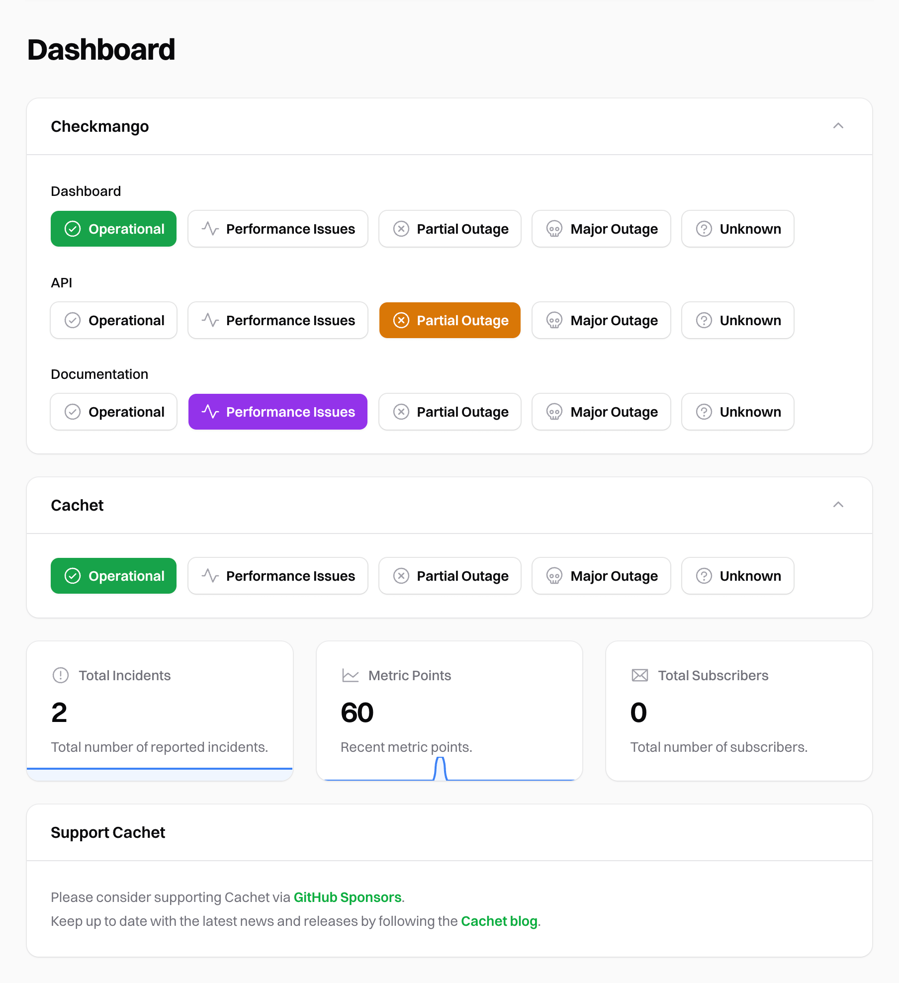
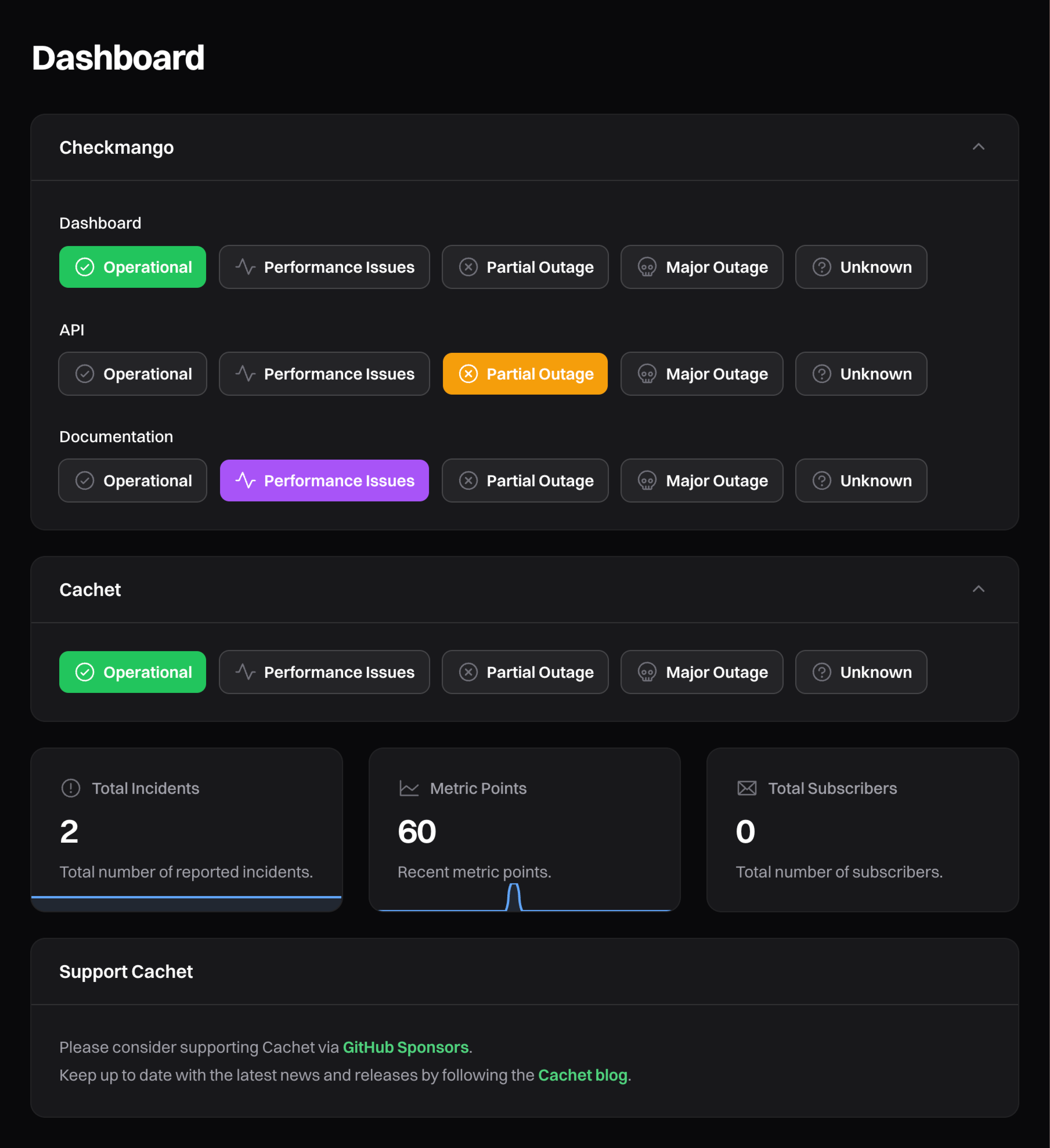
Cachet also provides a simple way of updating your component statuses directly from the dashboard homepage. Here you can update the status quickly by clicking the appropriate status button rather than navigating through the "Components" page.
 ### Component statuses
Components can have one of six statuses:
* **Operational**: The component is working as expected.
* **Performance Issues**: The component is experiencing performance issues.
* **Partial Outage**: The component is experiencing partial outage.
* **Major Outage**: The component is experiencing a major outage.
* **Unknown**: The component status is unknown.
* **Under Maintenance**: The component is undergoing maintenance. [Schedules](/docs/v3.x/guide/schedules) can set this status automatically.
## Component groups
To help organize your components, you can group them together into component groups. For example, you may have a
"Services" component group that contains all of your service components.
Cachet will automatically group any ungrouped components together. Cachet displays ungrouped components beneath any
component groups on your status page.
A component group has the following properties:
* **Name**: The name of the group.
* **Visibility**: Whether the group is visible to users, guests, or always hidden.
* **Collapsed**: How the group behaves on the status page (see [Collapse behavior](#collapse-behavior)).
* **Order by**: How components within the group are ordered (see [Ordering strategies](#ordering-strategies)).
### Group visibility
Like other resources, each component group has a visibility setting that controls who can see it:
* **Authenticated**: Only visible to authenticated dashboard users.
* **Guest**: Visible to everyone, including guests.
* **Hidden**: Never displayed on the status page.
### Collapse behavior
You can control whether a group appears expanded or collapsed on your status page. Each group can be set to one of:
* **Expanded**: The group is always expanded, showing all of its components.
* **Collapsed**: The group is always collapsed.
* **Collapsed unless a component is in an incident**: The group stays collapsed until one of its components is not operational, at which point Cachet expands it automatically. This keeps large status pages tidy while still drawing attention to problems.
## Reordering components
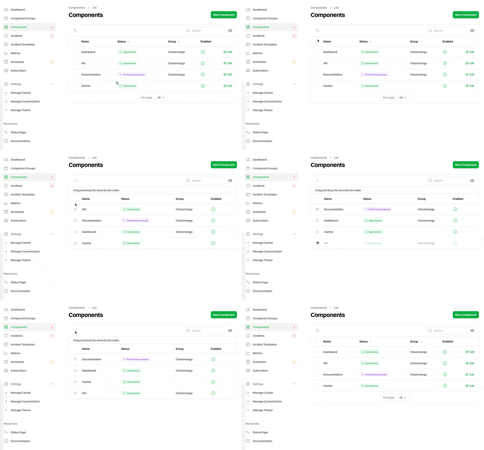
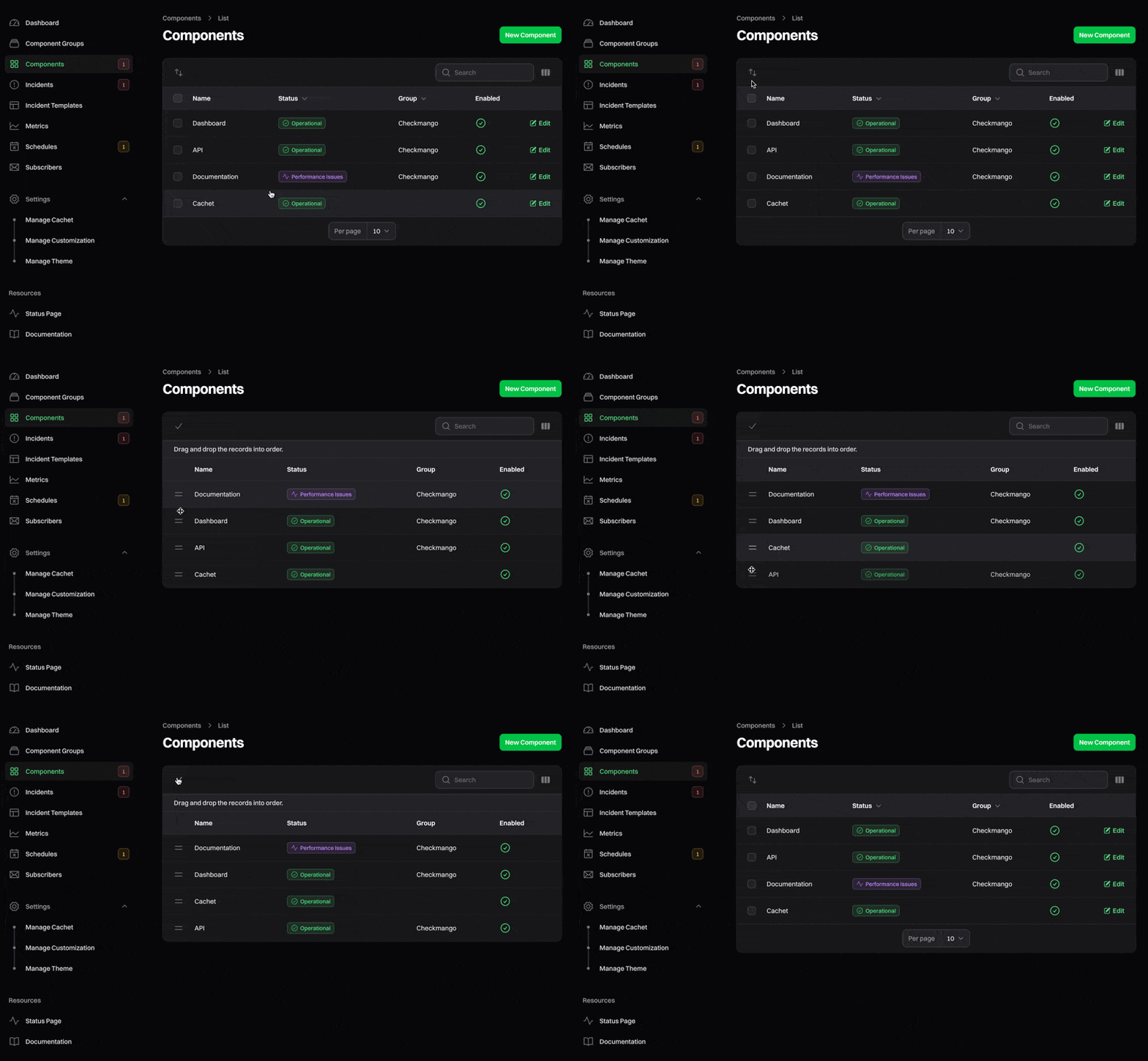
You may reorder components via the dashboard by dragging and dropping them into the desired order. To do this,
head to the "Components" page in the dashboard, click the swap icon (up and down arrows) in the top left of the table to
activate reordering mode, and then drag and drop the components into the desired order. Once you're happy with the new
order, click the check icon to save your changes.
You can also reorder components when editing a component group. The order will remain relative to the specific group.
### Component statuses
Components can have one of six statuses:
* **Operational**: The component is working as expected.
* **Performance Issues**: The component is experiencing performance issues.
* **Partial Outage**: The component is experiencing partial outage.
* **Major Outage**: The component is experiencing a major outage.
* **Unknown**: The component status is unknown.
* **Under Maintenance**: The component is undergoing maintenance. [Schedules](/docs/v3.x/guide/schedules) can set this status automatically.
## Component groups
To help organize your components, you can group them together into component groups. For example, you may have a
"Services" component group that contains all of your service components.
Cachet will automatically group any ungrouped components together. Cachet displays ungrouped components beneath any
component groups on your status page.
A component group has the following properties:
* **Name**: The name of the group.
* **Visibility**: Whether the group is visible to users, guests, or always hidden.
* **Collapsed**: How the group behaves on the status page (see [Collapse behavior](#collapse-behavior)).
* **Order by**: How components within the group are ordered (see [Ordering strategies](#ordering-strategies)).
### Group visibility
Like other resources, each component group has a visibility setting that controls who can see it:
* **Authenticated**: Only visible to authenticated dashboard users.
* **Guest**: Visible to everyone, including guests.
* **Hidden**: Never displayed on the status page.
### Collapse behavior
You can control whether a group appears expanded or collapsed on your status page. Each group can be set to one of:
* **Expanded**: The group is always expanded, showing all of its components.
* **Collapsed**: The group is always collapsed.
* **Collapsed unless a component is in an incident**: The group stays collapsed until one of its components is not operational, at which point Cachet expands it automatically. This keeps large status pages tidy while still drawing attention to problems.
## Reordering components
You may reorder components via the dashboard by dragging and dropping them into the desired order. To do this,
head to the "Components" page in the dashboard, click the swap icon (up and down arrows) in the top left of the table to
activate reordering mode, and then drag and drop the components into the desired order. Once you're happy with the new
order, click the check icon to save your changes.
You can also reorder components when editing a component group. The order will remain relative to the specific group.
 ### Ordering strategies
By default, components follow the manual drag-and-drop order described above. Component groups can also order their
components automatically. When editing a group, set "Order by" to one of:
* **Manual**: Respect the manual drag-and-drop order.
* **Name**: Order alphabetically by name.
* **Status**: Order by component status.
* **Last updated**: Order by when the component was last updated.
* **ID**: Order by the component's ID.
For every strategy except manual, you can also choose the direction (ascending or descending).
### Ordering strategies
By default, components follow the manual drag-and-drop order described above. Component groups can also order their
components automatically. When editing a group, set "Order by" to one of:
* **Manual**: Respect the manual drag-and-drop order.
* **Name**: Order alphabetically by name.
* **Status**: Order by component status.
* **Last updated**: Order by when the component was last updated.
* **ID**: Order by the component's ID.
For every strategy except manual, you can also choose the direction (ascending or descending).